Flexbox and CSS Grid: Revolutionizing Web Layout Techniques
In the ever-evolving landscape of web design, the way we structure and organize content on our websites has undergone remarkable transformations. The journey from table-based layouts to modern, responsive design approaches has been nothing short of a paradigm shift. Two powerful tools that have come to the forefront of this revolution are Flexbox and CSS Grid.
Understanding Flexbox
At the heart of the modern web layout lies Flexbox, a layout model designed to distribute space along a single axis – either horizontally or vertically. This concept of flexible boxes brings forth a structured way to create layouts that adapt seamlessly to various screen sizes.
Fundamentals of Flexbox
Flexbox introduces the notion of flex containers and flex items. The container becomes a reference point for controlling the layout, and the items inside it are the elements being laid out. This model comprises the main axis and the cross axis – terms critical to understanding how Flexbox works its magic.
On the main axis, you control the flow of items with the `flex-direction` property, determining whether they flow in rows or columns. Simultaneously, the cross axis is perpendicular to the main axis, providing alignment and spacing control.
Flexbox Properties
The toolkit of Flexbox is abundant with properties that enable fine-tuned control over layouts. `justify-content` aligns items along the main axis, while `align-items` does the same along the cross axis. The trio of `flex-grow`, `flex-shrink`, and `flex-basis` allow items to grow, shrink, and establish their base size proportionally.
Intriguingly, `align-self` lets individual items deviate from the alignment set by the container, enabling unique layouts within a flex container.
Creating Responsive Designs with Flexbox
Adapting layouts for various devices is at the core of responsive design. Flexbox plays a pivotal role in this by working harmoniously with media queries. This synergy allows designers to craft layouts that adjust seamlessly across different screen sizes.
The concept of flex-wrapping comes to the rescue when dealing with multi-line layouts. By allowing flex items to wrap onto new lines, you can create aesthetically pleasing layouts that don’t collapse on smaller screens.
In this section, we’ll unravel the marvels of CSS Grid and how it complements Flexbox in the realm of modern web layout.
Delving into CSS Grid
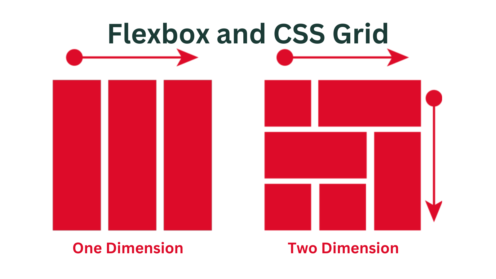
CSS Grid takes the concept of layout design to the next level by introducing a two-dimensional grid system. It empowers designers to control not only the placement of elements along a single axis but also their positioning in both rows and columns.
The Grid Concept
At its core, CSS Grid introduces the concept of grid containers and grid items. The container serves as the framework within which the items are arranged, forming a grid structure. This approach is a departure from traditional linear layouts, allowing for more complex and versatile designs.
The rows and columns of the grid are composed of tracks, which define the size of the rows and columns. This flexibility grants designers unparalleled control over the spatial arrangement of elements.
Defining the Grid
Defining the grid involves setting up the rows and columns using properties like `grid-template-rows` and `grid-template-columns`. This is where designers can specify the size and distribution of the tracks, creating the foundation for the layout.
The introduction of `grid-gap` and `grid-template-areas` further enhances the precision of design. `grid-gap` controls the spacing between cells, maintaining a clean and organized structure. Meanwhile, `grid-template-areas` enables designers to name and assign areas within the grid to specific items, simplifying the layout process.
Grid Alignment and Placement
The power of CSS Grid extends to precise alignment control. `justify-items` and `align-items` enable designers to align items along both axes with ease. Similarly, `justify-self` and `align-self` give individual items the autonomy to deviate from the default alignment, opening doors for creative layouts.
The `grid-row` and `grid-column` properties offer an intuitive way to position items within the grid, specifying the starting and ending positions along the row and column axes. This pixel-perfect control is particularly valuable for creating intricate designs.
As we’ve explored the realms of Flexbox and CSS Grid, the question arises: when should one opt for Flexbox, and when does CSS Grid prove to be the superior choice? We’ll dissect this dilemma in the following section.
When to Choose Flexbox or CSS Grid
Understanding the strengths of Flexbox and CSS Grid is pivotal in making an informed choice for your layout needs.
Use Cases for Flexbox
Flexbox shines in scenarios where you’re dealing with one-dimensional layouts. This includes aligning items along a single axis, creating equal-sized elements, and distributing space in a linear manner. It excels in scenarios where content flows in rows or columns, and you need responsive designs with minimal complexity.
Use Cases for CSS Grid
CSS Grid’s power lies in tackling complex, two-dimensional layouts. When you’re faced with intricate designs involving both rows and columns, such as magazine-like layouts, masonry grids, or dashboard interfaces, CSS Grid emerges as the go-to solution. Its fine-grained control and ability to create dynamic patterns make it an unparalleled choice for such scenarios.