Combining Flexbox and CSS Grid
Combining Flexbox and CSS Grid might just be the secret sauce for creating even more dynamic and versatile layouts. Let’s explore the magic of synergy in the following section.
Combining Flexbox and CSS Grid
Harnessing the strengths of both Flexbox and CSS Grid can lead to a harmonious layout strategy that caters to various design challenges.
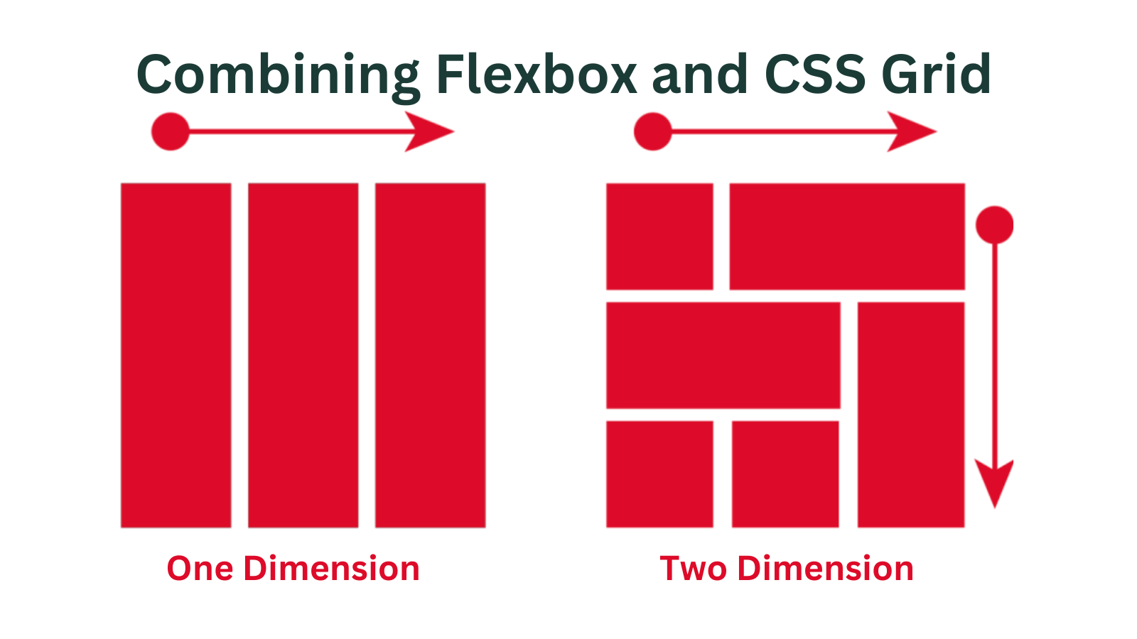
The Synergy of Flexbox and Grid
Flexbox and CSS Grid are not mutually exclusive; in fact, they can complement each other beautifully. Flexbox can be used inside a CSS Grid item to manage the internal structure of that item, providing a one-dimensional layout within the context of a larger grid.
Conversely, CSS Grid can house Flexbox containers as grid items, allowing for intricate arrangements of flexible content within a larger two-dimensional layout. This versatility enables designers to create sophisticated and adaptive designs that blend the strengths of both techniques.
Browser Support and Considerations
While Flexbox and CSS Grid have garnered widespread support among modern browsers, it’s essential to consider compatibility across different platforms.
Compatibility Across Different Browsers
Both Flexbox and CSS Grid are supported by major modern browsers, including Chrome, Firefox, Safari, and Edge. However, older versions of Internet Explorer have limited support for these techniques, so it’s crucial to have fallback strategies in place for those scenarios.
Progressive Enhancement and Graceful Degradation
Adopting a progressive enhancement approach ensures that your layout remains functional even in browsers that do not fully support Flexbox or CSS Grid. By creating a solid baseline layout with traditional CSS and then enhancing it with Flexbox or Grid features, you ensure a graceful degradation of design in less capable browsers.
As we gaze into the horizon of web design, it’s intriguing to contemplate the future of layout techniques. Let’s explore the potential advancements awaiting us in the world of Flexbox and CSS Grid.
Future of Layout: Flexbox and CSS Grid
The landscape of web design is in a perpetual state of evolution, and layout techniques are no exception.
Evolution of Web Layout Techniques
Flexbox and CSS Grid mark a significant shift from the rigid structures of the past to the dynamic layouts of the future. As browser support improves and the developer community delves deeper into these techniques, we can expect innovative use cases and enhancements that continue to redefine the possibilities of web design.
Potential Advancements and Wider Adoption
With the growing recognition of the benefits offered by Flexbox and CSS Grid, it’s reasonable to anticipate wider adoption across the web development industry. As designers become more adept at utilizing these tools, we can look forward to seeing more intricate and creative layouts that leverage the full potential of these techniques.
In the quest for effective and efficient layout creation, adhering to best practices is crucial. Join us in the following section as we explore the art of crafting impeccable layouts with Flexbox and CSS Grid.
Best Practices for Efficient Layouts
Mastering Flexbox and CSS Grid is more than just understanding the properties; it’s about employing these tools effectively to create layouts that not only look great but also perform well.
Keeping the Markup Clean and Semantic
A key principle in web design is maintaining clean, semantic HTML. When working with Flexbox and CSS Grid, avoid unnecessary divitis and overly complex structures. Keep the markup minimal, using the layout techniques to orchestrate the visual presentation.
Optimal Use of Flexbox and Grid
Strive for a balanced approach when choosing between Flexbox and CSS Grid. Leverage Flexbox for simpler, linear layouts and rely on CSS Grid for more intricate, grid-based designs. Combining both techniques judiciously can yield versatile and responsive layouts.
Performance Considerations and Optimization Techniques
While Flexbox and CSS Grid offer powerful layout solutions, it’s important to consider performance implications. Excessive nesting of Flexbox or Grid containers can lead to increased rendering times. Minimize the use of unnecessary properties and choose the appropriate technique based on the complexity of your design.
Learning Resources and Tutorials
Embarking on a journey to master Flexbox and CSS Grid is exciting, and there’s a wealth of learning resources available to aid in your quest.
Online Courses and Documentation
Online platforms offer comprehensive courses dedicated to mastering Flexbox and CSS Grid. Websites like MDN Web Docs and W3Schools provide thorough documentation and interactive tutorials that guide you through the ins and outs of these layout techniques.
Interactive Code Playgrounds for Practice
Websites like CodePen and JSFiddle provide interactive code playgrounds where you can experiment with Flexbox and CSS Grid. These platforms allow you to visualize the effects of different properties in real time, accelerating your learning process.
Transitioning from theory to practice, let’s delve into real-world case studies that demonstrate the prowess of Flexbox and CSS Grid in actual design scenarios.
Case Studies: Real-World Examples
Examining practical applications of Flexbox and CSS Grid can offer insights into their capabilities and versatility.
Showcasing Flexbox-Driven Layouts
Imagine a news website with a responsive homepage featuring articles and sidebars. Utilizing Flexbox, you can effortlessly create a layout where articles flow in a column on smaller screens and adjust to a row on larger screens, all while ensuring consistent alignment.
Highlighting CSS Grid-Powered Designs
Consider an e-commerce platform with a product listing page. CSS Grid can come to the rescue by providing a structured grid layout, allowing for easy arrangement of products with consistent spacing. This technique ensures that each product thumbnail aligns perfectly, regardless of the content’s varying dimensions.
Despite their power, Flexbox and CSS Grid present their own set of challenges. Let’s dive into the intricacies of overcoming these hurdles.
Overcoming Common Challenges
As with any technology, Flexbox and CSS Grid can present challenges that require careful consideration.
Debugging Layout Issues
Even with a solid understanding of these techniques, unexpected layout issues can arise. Utilize browser developer tools to inspect and troubleshoot layout problems. These tools allow you to visualize the box model, element dimensions, and alignment, aiding in pinpointing and rectifying issues.
Handling Browser Quirks and Anomalies
Different browsers may interpret Flexbox and CSS Grid properties slightly differently. Cross-browser testing is crucial to ensure your layouts appear consistent across various platforms. Employ vendor prefixes and fallback strategies to mitigate compatibility issues.
Creating layouts that are accessible to all users is paramount. Let’s explore how Flexbox and CSS Grid can be leveraged to craft designs that prioritize inclusivity.
Crafting Accessible Layouts with Flexbox and Grid
In the pursuit of exceptional design, accessibility must not be overlooked. Flexbox and CSS Grid can contribute to crafting layouts that cater to a diverse audience.
Prioritizing Accessibility in Web Design
Web accessibility ensures that people with disabilities can perceive, navigate, and interact with websites effectively. When using Flexbox and CSS Grid, maintain a focus on semantic HTML and use appropriate ARIA roles and attributes to enhance the user experience for individuals using assistive technologies.
Leveraging ARIA Roles and Attributes
ARIA (Accessible Rich Internet Applications) roles and attributes provide additional context to assistive technologies. When building complex layouts, consider using ARIA landmarks to define regions within the page, ensuring that screen readers can navigate the content seamlessly.
Flexbox and CSS Grid not only thrive within individual projects but also seamlessly integrate with popular frameworks and libraries. Let’s explore their role in this ecosystem.
Flexbox and Grid in Frameworks and Libraries
The power of Flexbox and CSS Grid extends beyond standalone projects and into the realm of frontend frameworks and CSS libraries.
Integrating Layout Techniques into Frontend Frameworks
Popular frontend frameworks like Bootstrap and Foundation have embraced the principles of Flexbox and CSS Grid. They provide layout components that leverage these techniques, allowing developers to create responsive designs more efficiently.
Customizing Layouts with Flexbox and Grid in CSS Libraries
CSS libraries such as Tailwind CSS offer utility classes that streamline the application of Flexbox and CSS Grid properties. These libraries empower developers to create complex layouts by simply adding classes to their HTML elements, thus expediting the design process.
As the world becomes increasingly mobile-centric, responsive web design takes center stage. Join us as we explore the role of Flexbox and CSS Grid in crafting adaptable layouts.
The Role of Flexbox and Grid in Responsive Web Design
In the era of smartphones and tablets, responsive web design is no longer an option – it’s a necessity. Flexbox and CSS Grid play a pivotal role in creating layouts that adapt seamlessly to various screen sizes.
Fluid and Adaptive Layouts with Flexbox and Grid
Flexbox and CSS Grid excel in creating fluid and adaptive layouts. With Flexbox, elements can easily adjust their size and position to accommodate different screen sizes. On the other hand, CSS Grid’s two-dimensional structure provides unparalleled control over how items rearrange themselves to fit various viewports.
Media Queries and Breakpoints for Responsive Designs
Media queries serve as the backbone of responsive design. By strategically placing breakpoints within your CSS, you can trigger layout adjustments as the screen size changes. When paired with Flexbox and CSS Grid, media queries allow for seamless transitions between different layouts, ensuring a consistent user experience across devices
In closing, Flexbox and CSS Grid empower designers and developers to revolutionize web layout techniques. Let’s reflect on the journey we’ve embarked upon.
Conclusion
Flexbox and CSS Grid have emerged as groundbreaking tools that have transformed the way we approach web layout. Their unique strengths and versatility have elevated the possibilities of design, enabling us to create intricate and adaptive layouts that cater to diverse needs.
As we continue to explore the evolving landscape of web design, the mastery of Flexbox and CSS Grid remains a cornerstone skill for any designer or developer. By understanding their fundamentals, leveraging their capabilities, and adhering to best practices, we can unlock the potential to craft exceptional layouts that seamlessly adapt to the dynamic digital world.